
Where to add your own styling
You have three places, and it matters which you pick.
1. The plugin’s Custom CSS box
AIQ Ecommerce Products → API Settings → Tools & Debug → Custom CSS Paste CSS in, click Save Custom CSS, and it is applied on the front end.
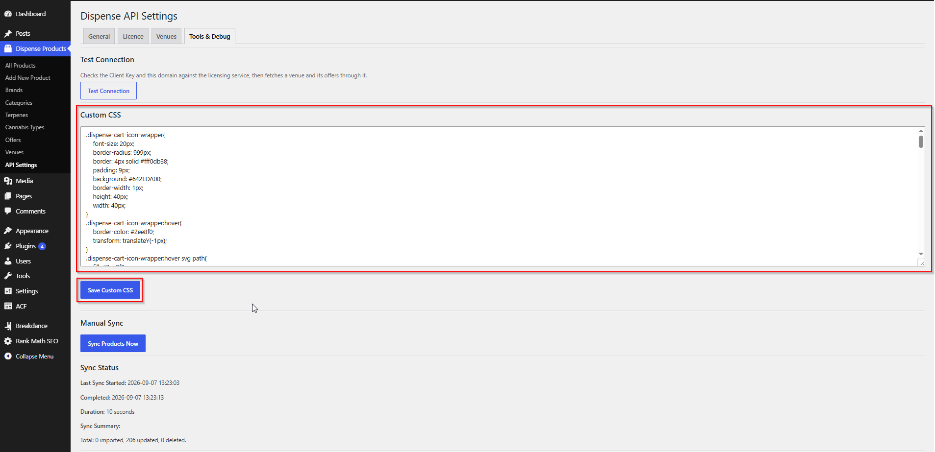
Best for: small overrides, quick fixes, and keeping AIQ Ecommerce-related styling in one obvious place. It travels with the plugin settings, so it survives theme changes.
Not for: large stylesheets. There is no syntax highlighting and no version control.
2. Your theme or child theme
Add to your child theme’s style.css, or via Appearance → Customize → Additional CSS.
Best for: anything substantial, anything that needs to sit alongside your other styles, and anything you want in version control.
3. Your page builder
Elementor, Bricks and Breakdance all have per-element and global CSS.
Best for: styling a specific layout you built. Keep general product styling out of it — it is harder to find later.
Which to use
| Situation | Where |
|---|---|
| One-line fix | Custom CSS box |
| Styling the cart sidebar | Custom CSS box or child theme |
| A whole design system | Child theme |
| Styling one page's layout | Page builder |
| Anything under version control | Child theme |
Styling the product listings
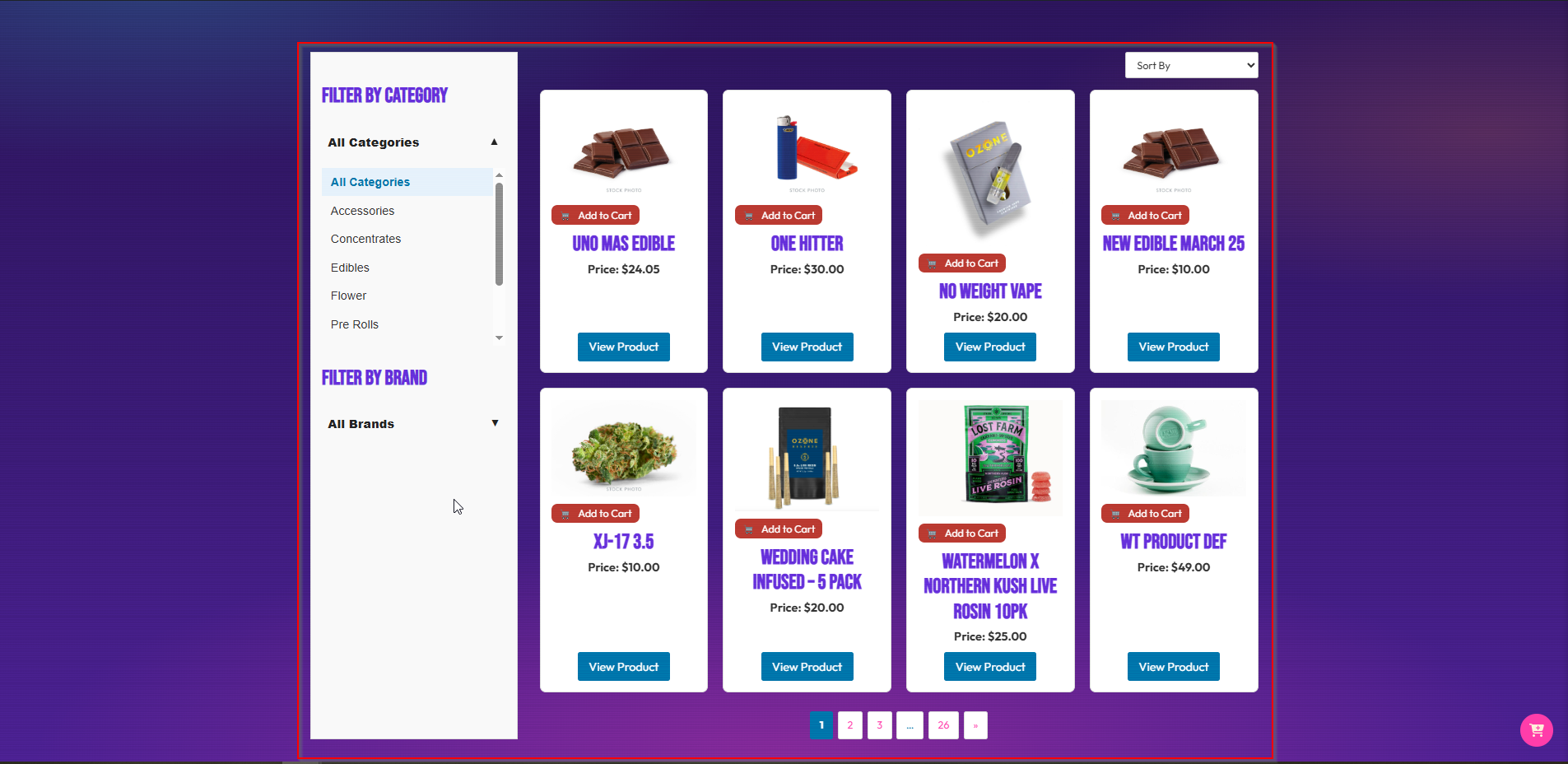
The built-in listing shortcodes produce a predictable structure:
.dispense-wrapper
├── .dispense-filters              (the filter sidebar)
└── .dispense-products
    ├── .dispense-sort             (the sort dropdown)
    ├── ul.dispense-product-list
    │   └── li.dispense-product-item
    │       ├── .dispense-product-thumbnail
    │       │   ├── img
    │       │   └── .dispense-add-to-cart-btn
    │       ├── .dispense-product-content-body
    │       │   ├── h3               (product name)
    │       │   └── p                (price)
    │       └── .dispense-product-view-btn
    └── .dispense-pagination
Common adjustments
A four-column grid:
.dispense-product-list {
    grid-template-columns: repeat(4, 1fr);
}
Card styling:
.dispense-product-item {
    border: 1px solid #e5e5e5;
    border-radius: 12px;
    padding: 16px;
    background: #fff;
    transition: box-shadow .2s ease;
}
.dispense-product-item:hover {
    box-shadow: 0 4px 16px rgba(0,0,0,.08);
}
Consistent image heights:
.dispense-product-thumbnail img {
    aspect-ratio: 1 / 1;
    object-fit: contain;
    width: 100%;
}
Brand-coloured buttons:
.dispense-product-view-btn,
.dispense-add-to-cart-btn {
    background: var(--brand-primary, #1c7c54);
    color: #fff;
    border-radius: 8px;
}
Pagination:
.dispense-pagination .current {
    background: var(--brand-primary, #1c7c54);
    color: #fff;
}
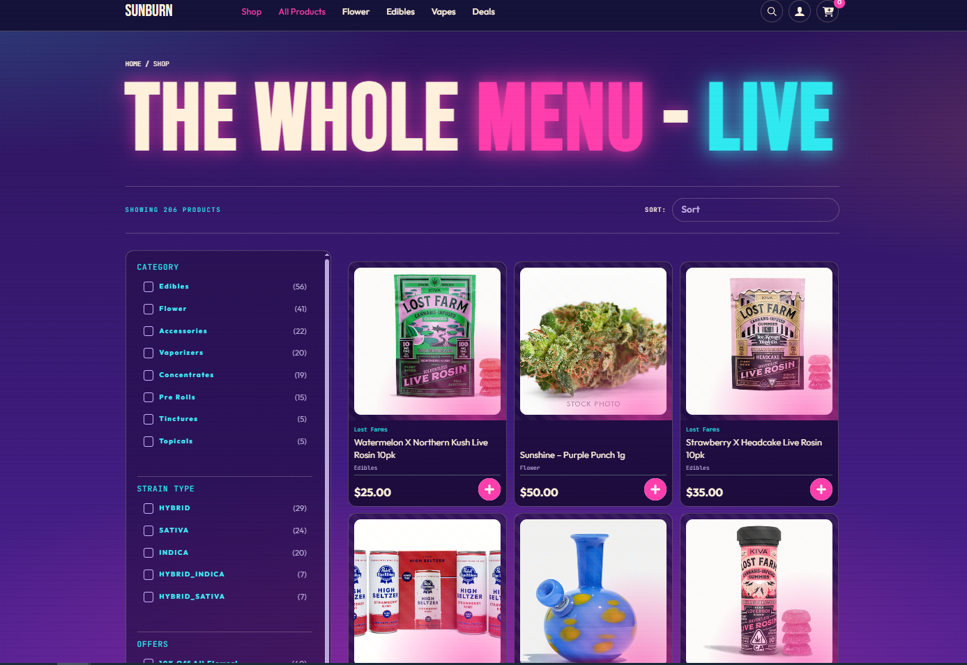
The filter interface
.dispense-filters { /* the sidebar */ }
.dispense-sort select { /* the sort dropdown */ }
.lb_prod_filter_attr_box { /* a filter group */ }
.lb_prod_filter_attr_title { /* the dropdown button */ }
.prod_filter_ul li { /* an option */ }
.prod_filter_ul li.selected { /* the chosen option */ }
Styling the cart and checkout
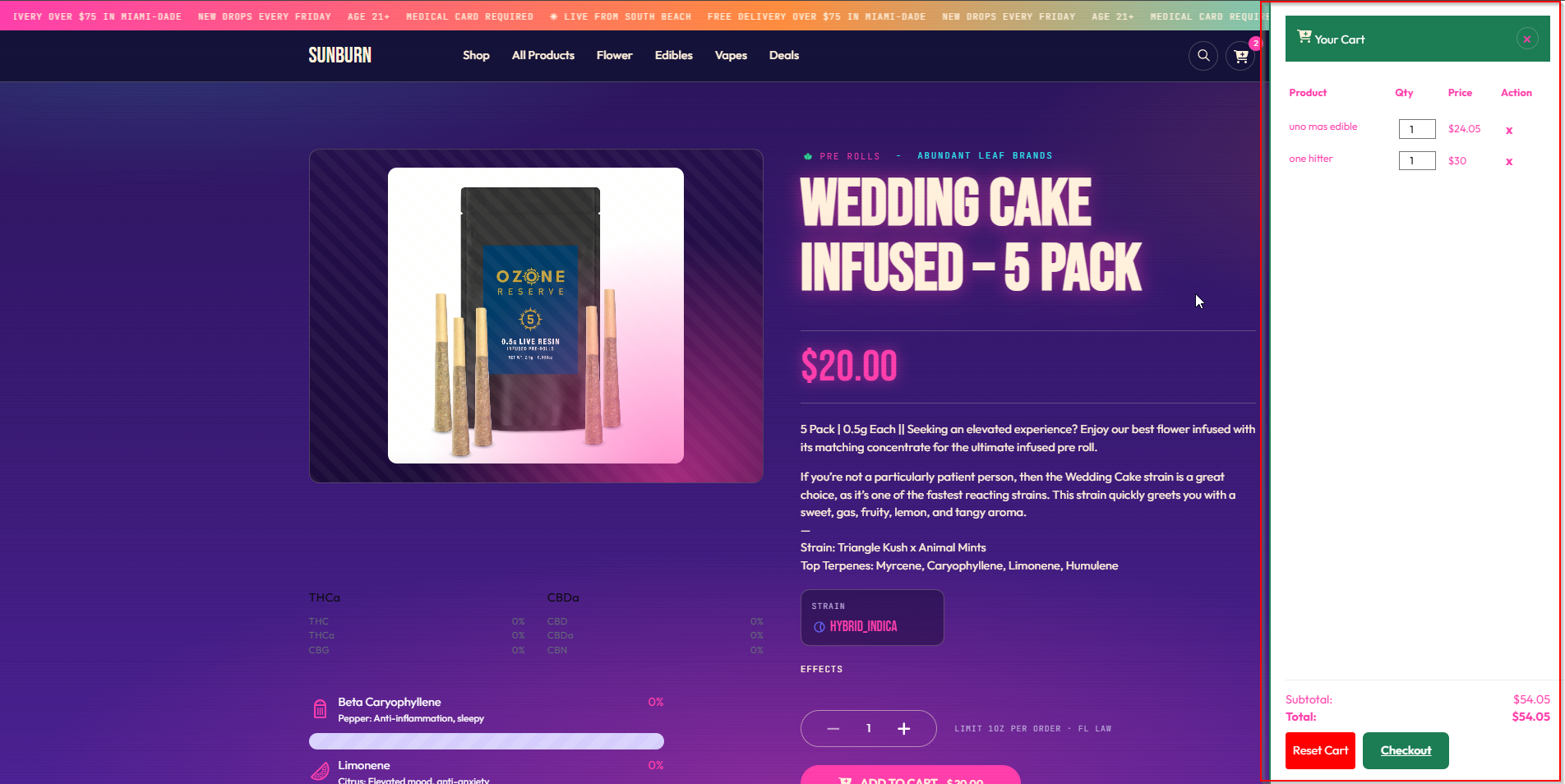
The cart sidebar
| Class / ID | Element |
|---|---|
.dispense-cart-sidebar |
The sidebar wrapper |
.dispense-cart-header |
Header |
.dispense-cart-close |
Close button |
.dispense-cart-sidebar-floating-icon |
Floating cart button |
.dispense-cart-container |
Scrollable content area |
.dispense-cart-empty-message |
Empty cart message |
.dispense-cart-table |
Item table |
.dispense-cart-table th |
Table headings |
.dispense-cart-table td |
Table cells |
.dispense-remove-product |
Remove item button |
.dispense-cart-footer |
Footer |
.dispense-cart-subtotal |
Subtotal line |
.dispense-cart-tax |
Tax line |
.dispense-cart-total |
Total line |
.dispense-cart-buttons |
Button wrapper |
#dispense-reset-cart |
Reset button |
#dispense-checkout-btn |
Checkout button |
A branded sidebar:
.dispense-cart-sidebar {
    background: #fff;
    border-left: 3px solid var(--brand-primary, #1c7c54);
}
.dispense-cart-header {
    background: var(--brand-primary, #1c7c54);
    color: #fff;
    padding: 16px;
}
#dispense-checkout-btn {
    background: var(--brand-primary, #1c7c54);
    color: #fff;
    padding: 14px 24px;
    border-radius: 8px;
    display: block;
    text-align: center;
    font-weight: 600;
}
The cart icon and count badge
.dispense-cart-icon-wrapper { position: relative; }

.dispense-cart-count {
    background: var(--brand-accent, #d64545);
    color: #fff;
    border-radius: 50%;
    min-width: 20px;
    height: 20px;
    font-size: 12px;
    display: inline-flex;
    align-items: center;
    justify-content: center;
}
To replace the icon itself, use the Cart Icon setting on the General tab rather than CSS — it takes an image URL or raw SVG.
The add-to-cart toast
#dispense-cart-toast {
    background: #1c1c1c;
    color: #fff;
    border-radius: 8px;
    padding: 12px 20px;
}
The checkout page
What you can style is the page around it — and only when you have chosen the theme layout option.
In the default minimal shell there is nothing around it to style.
.dispense-checkout-minimal-page {
    background: #fafafa;
}
Styling offers and banners
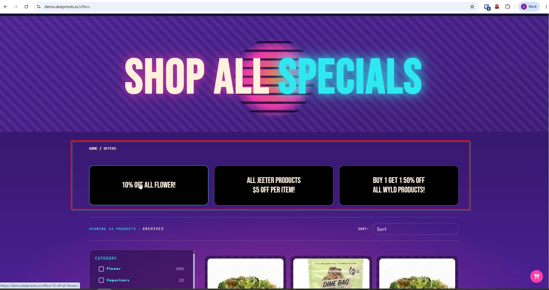
The offers grid
.dispense-offers-grid
└── .dispense-offer-card
    ├── .dispense-offer-card__banner
    ├── .dispense-offer-card__name
    └── .dispense-offer-card__type
.dispense-offers-grid {
    gap: 24px;
}
.dispense-offer-card {
    border-radius: 12px;
    overflow: hidden;
    box-shadow: 0 2px 8px rgba(0,0,0,.06);
}
.dispense-offer-card__banner {
    width: 100%;
    height: auto;
    display: block;
}
.dispense-offer-card__type {
    background: var(--brand-accent, #d64545);
    color: #fff;
    font-size: 12px;
    text-transform: uppercase;
    letter-spacing: .04em;
    padding: 4px 10px;
    border-radius: 4px;
}
Offer badges on products
The offer name comes from dispense_product_offer, so how you style it depends on the markup your template produces. Give the element your own class and style that:
.product-offer-badge {
    position: absolute;
    top: 10px;
    left: 10px;
    background: var(--brand-accent, #d64545);
    color: #fff;
    padding: 4px 10px;
    border-radius: 4px;
    font-size: 12px;
}
Sale prices
.product-price--was {
    text-decoration: line-through;
    opacity: .6;
}
.product-price--now {
    color: var(--brand-accent, #d64545);
    font-weight: 700;
}
Mobile and responsive behaviour
The plugin’s own styles include a small number of breakpoints — a single-column pagination adjustment below 480px, a product detail layout change at 700px, and a further adjustment at 992px.
Everything else is left for you, deliberately: your theme’s breakpoints should win.
A sensible responsive listing
.dispense-product-list {
    display: grid;
    gap: 20px;
    grid-template-columns: repeat(2, 1fr);
}

@media (min-width: 768px) {
    .dispense-product-list { grid-template-columns: repeat(3, 1fr); }
}

@media (min-width: 1200px) {
    .dispense-product-list { grid-template-columns: repeat(4, 1fr); }
}
Filters on mobile
The filter sidebar sits above the products on narrow screens. If that pushes the products too far down, collapse it:
@media (max-width: 767px) {
    .dispense-filters {
        position: sticky;
        top: 0;
        z-index: 10;
        background: #fff;
    }
}
The cart sidebar on mobile
Full width is usually right:
@media (max-width: 600px) {
    .dispense-cart-sidebar {
        width: 100%;
        max-width: none;
    }
}
Touch targets
Keep interactive elements at least 44 × 44 pixels:
@media (max-width: 767px) {
    .dispense-add-to-cart-btn,
    .dispense-product-view-btn,
    .dispense-remove-product {
        min-height: 44px;
    }
}
A worked example
A complete starter block for the Custom CSS box. Replace the colours with your own.
/* ---- Brand palette ---- */
:root {
    --brand-primary: #1c7c54;
    --brand-accent:  #d64545;
    --brand-ink:     #1c1c1c;
    --brand-line:    #e5e5e5;
}

/* ---- Product listing ---- */
.dispense-product-list {
    display: grid;
    gap: 20px;
    grid-template-columns: repeat(2, 1fr);
}
@media (min-width: 768px)  { .dispense-product-list { grid-template-columns: repeat(3, 1fr); } }
@media (min-width: 1200px) { .dispense-product-list { grid-template-columns: repeat(4, 1fr); } }

.dispense-product-item {
    border: 1px solid var(--brand-line);
    border-radius: 12px;
    padding: 16px;
    background: #fff;
}
.dispense-product-thumbnail img {
    aspect-ratio: 1 / 1;
    object-fit: contain;
    width: 100%;
}
.dispense-product-item h3 {
    font-size: 16px;
    color: var(--brand-ink);
    margin: 12px 0 4px;
}

/* ---- Buttons ---- */
.dispense-add-to-cart-btn,
.dispense-product-view-btn,
#dispense-checkout-btn {
    background: var(--brand-primary);
    color: #fff;
    border: 0;
    border-radius: 8px;
    padding: 12px 20px;
    font-weight: 600;
    cursor: pointer;
}

/* ---- Cart ---- */
.dispense-cart-sidebar { background: #fff; }
.dispense-cart-header  { background: var(--brand-primary); color: #fff; padding: 16px; }
.dispense-cart-count   { background: var(--brand-accent); color: #fff; border-radius: 50%; }

/* ---- Offers ---- */
.dispense-offer-card       { border-radius: 12px; overflow: hidden; }
.dispense-offer-card__type { background: var(--brand-accent); color: #fff; }
Common problems
My CSS has no effect.
Three things, in order: clear your caches — page cache, CSS minification and browser; check the selector actually matches, using your browser’s inspector; and only then consider specificity.
It works logged in but not logged out.
Caching. Clear the page cache.
The cart sidebar looks wrong on mobile.
Give it a width and remove any max-width at your mobile breakpoint.
My theme's styles are overriding the plugin's.
That is usually what you want. Where it is not, increase your selector’s specificity rather than reaching for !important.
The checkout page ignores my styling.
It is an iframe. You cannot style its contents. Only the page around it, and only in theme layout mode.
Custom CSS disappeared.
Check you clicked Save Custom CSS — the Custom CSS form has its own save button, separate from Save Settings on the General tab.